Jobsocks.com
Jobsocks.com
Jobsocks.com
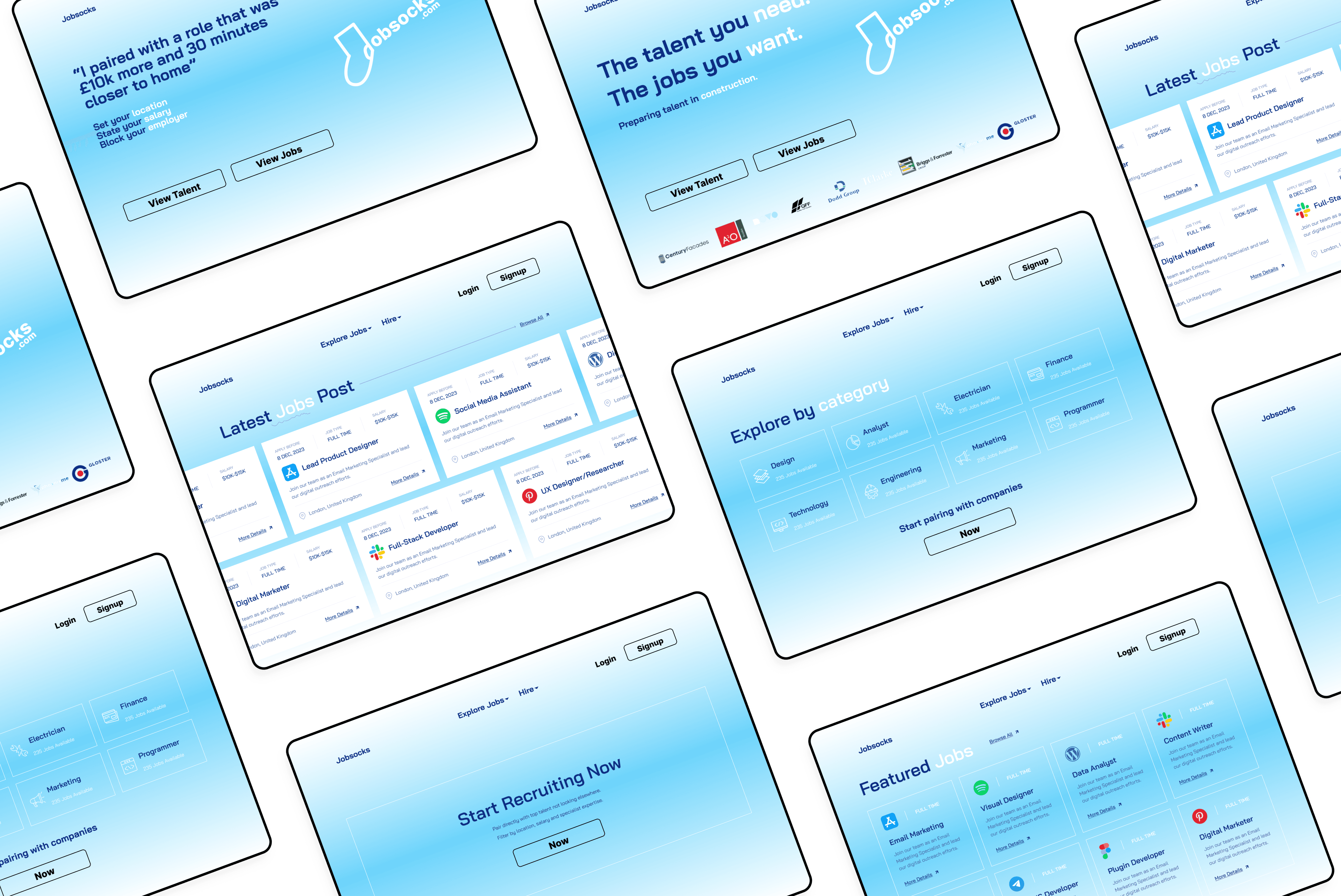
In this case study, I present a transformative redesign of the Jobsocks landing page, aimed at enhancing user engagement, optimizing navigation, and elevating the overall user experience to drive increased conversions.
In this case study, I present a transformative redesign of the Jobsocks landing page, aimed at enhancing user engagement, optimizing navigation, and elevating the overall user experience to drive increased conversions.
In this case study, I present a transformative redesign of the Jobsocks landing page, aimed at enhancing user engagement, optimizing navigation, and elevating the overall user experience to drive increased conversions.

Roles
Roles
UX Designer UX Researcher
UX Designer UX Researcher
UX Designer UX Researcher
Deliverables
Deliverables
Website Landing Page
Website Landing Page
Website Landing Page
Project Specifications
Project Specifications
Duration: 1 week
Tools: Figma
Duration: 1 week
Tools: Figma
Duration: 1 week
Tools: Figma
Overview
Overview
Overview
The primary goal of this redesign is to enhance the visual appeal and functionality of the Jobsocks landing page, ensuring a seamless and intuitive user experience. The emphasis is on quick and efficient matching, aligning with the platform's core objective.
The primary goal of this redesign is to enhance the visual appeal and functionality of the Jobsocks landing page, ensuring a seamless and intuitive user experience. The emphasis is on quick and efficient matching, aligning with the platform's core objective.
The primary goal of this redesign is to enhance the visual appeal and functionality of the Jobsocks landing page, ensuring a seamless and intuitive user experience. The emphasis is on quick and efficient matching, aligning with the platform's core objective.
Results
Results
Results
The redesigned app features a clean, clutter-free interface, making it easier for users to navigate and access essential features.
A more visually appealing and user-friendly landing page attracts more traffic, resulting in increased exposure and visibility.
The redesigned app features a clean, clutter-free interface, making it easier for users to navigate and access essential features.
A more visually appealing and user-friendly landing page attracts more traffic, resulting in increased exposure and visibility.
The redesigned app features a clean, clutter-free interface, making it easier for users to navigate and access essential features.
A more visually appealing and user-friendly landing page attracts more traffic, resulting in increased exposure and visibility.


Process
Process
Process
Mockup Analysis: Carefully reviewed the client-provided mockups, identifying key design elements and user flows.
Interactive Prototyping: Leveraged Figma to convert static mockups into an interactive prototype, allowing for a realistic preview of user interactions and navigation.
Visual Enhancement: Streamlined the visual elements, ensuring a clean and visually appealing design that aligns with Jobsocks branding.
User Journey Refinement: Analyzed and refined the user journey to prioritize quick and efficient matching, minimizing friction in the overall experience.
Feedback Integration: Collaborated with the client, incorporating feedback loops to refine and fine-tune design elements for optimal user satisfaction.


Conclusion
Conclusion
Conclusion
The redesigned landing page for Jobsocks introduces a fresh and inviting interface that aligns with the platform's mission of rapid job matching. By enhancing both aesthetics and functionality, the redesign aims to capture user interest swiftly and facilitate seamless connections between job seekers and employers.
The redesigned landing page for Jobsocks introduces a fresh and inviting interface that aligns with the platform's mission of rapid job matching. By enhancing both aesthetics and functionality, the redesign aims to capture user interest swiftly and facilitate seamless connections between job seekers and employers.
The redesigned landing page for Jobsocks introduces a fresh and inviting interface that aligns with the platform's mission of rapid job matching. By enhancing both aesthetics and functionality, the redesign aims to capture user interest swiftly and facilitate seamless connections between job seekers and employers.
Please note that this case study is a fictional project created for educational purposes only. All data, insights, and conclusions presented are hypothetical and not based on real-life scenarios or outcomes. The goal of this case study is to demonstrate skills and techniques in UX/UI design and not to represent any actual company or product.
Please note that this case study is a fictional project created for educational purposes only. All data, insights, and conclusions presented are hypothetical and not based on real-life scenarios or outcomes. The goal of this case study is to demonstrate skills and techniques in UX/UI design and not to represent any actual company or product.
Please note that this case study is a fictional project created for educational purposes only. All data, insights, and conclusions presented are hypothetical and not based on real-life scenarios or outcomes. The goal of this case study is to demonstrate skills and techniques in UX/UI design and not to represent any actual company or product.


